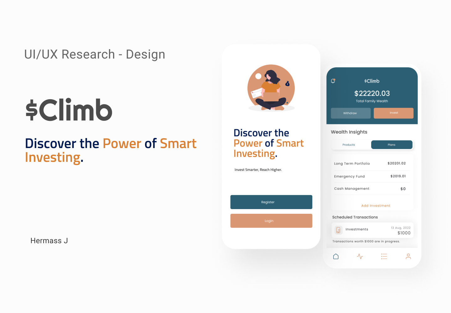

Key Design System and Style Guide
Detailed information on the typefaces, font weights, and styles that maintain consistency and readability throughout our digital products.

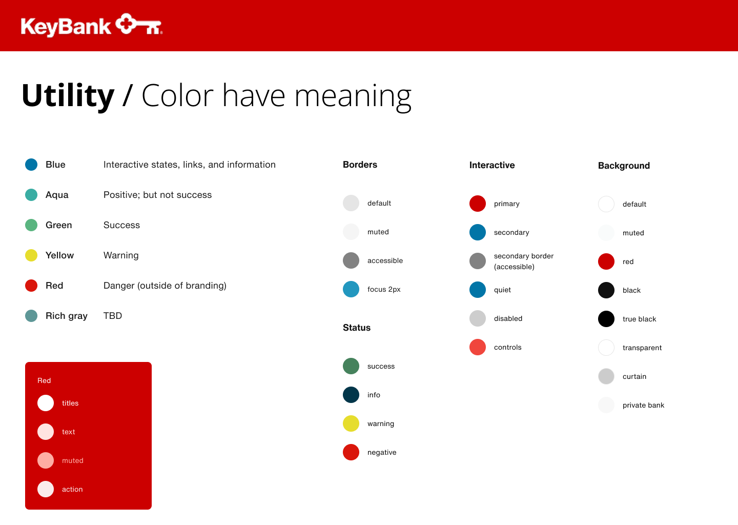
A curated selection of primary and secondary colors that reflect our Key brand’s vibrancy and evoke specific emotions.

A curated selection of primary and secondary colors that reflect our Key brand’s vibrancy and evoke specific emotions.
A comprehensive set of icons that visually communicate key actions, enhancing user understanding and interaction.

Buttons, Primary, Secondary, Active, Inactive.

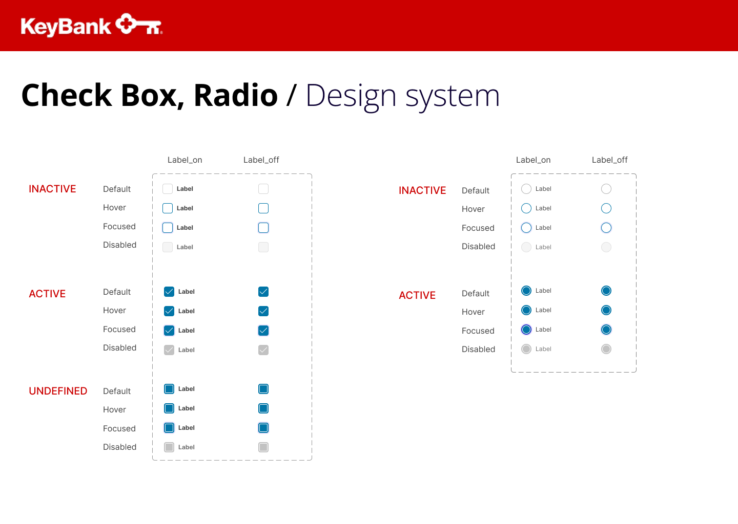
Checkbox and Radio Types
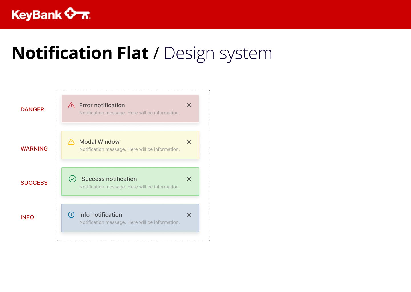
Fundamental UX principles that inform our design decisions and prioritize user-centric experiences. Below the Input UI components.

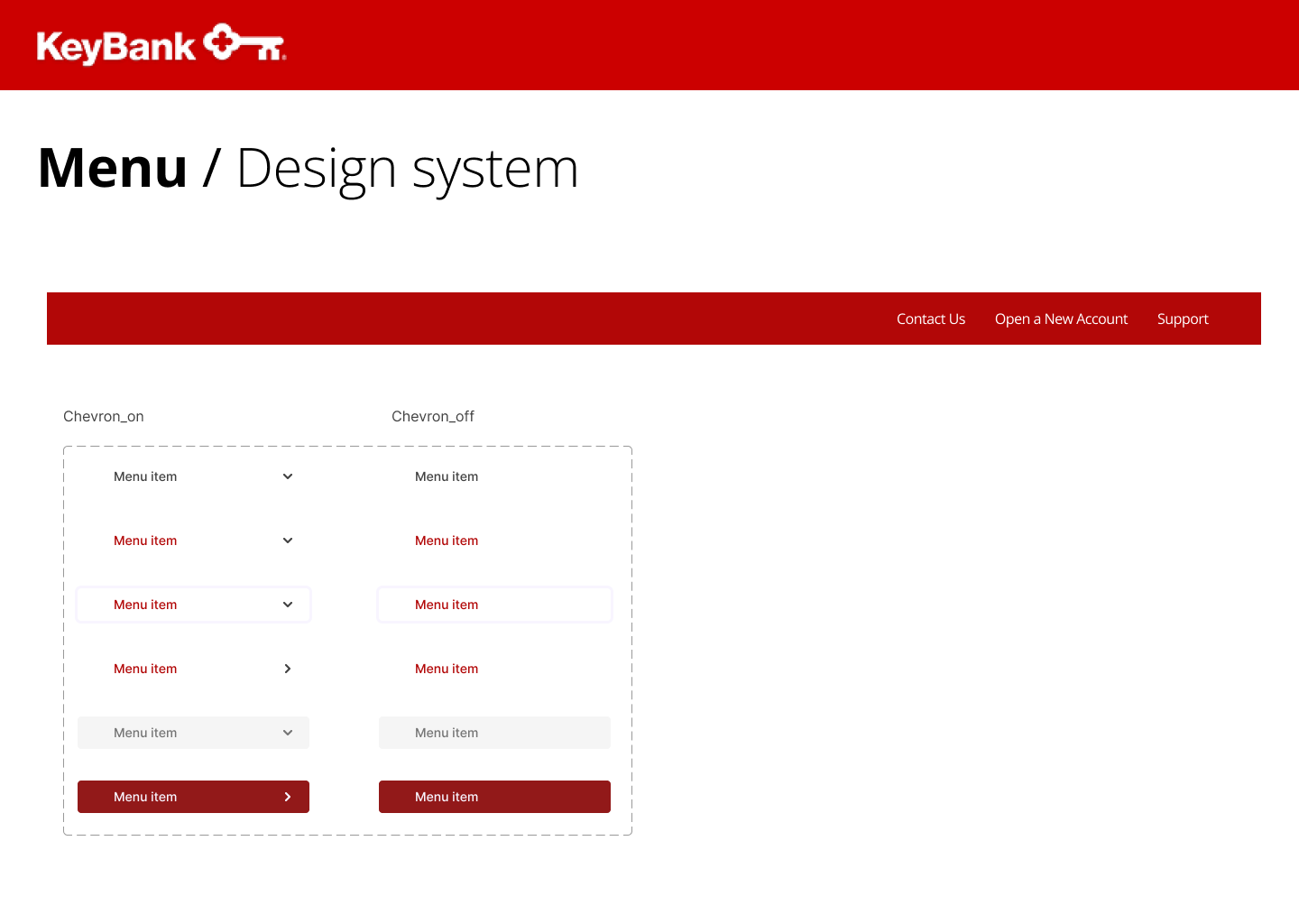
The above introduction and summary provide a glimpse into the purpose and content of a Brand Design System and Style Guide for UI/UX. This guide serves as a comprehensive resource that aligns design decisions with the brand identity and user experience, ensuring consistency and coherence across all digital interfaces.